Plot Setup Dialog Reference
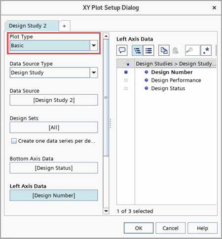
Properties of Plot Setup Dialog
- Plot Type
- Specifies the type of plotting method. All the plot types are listed:
Plot Type Example - Bar
- Displays data as a bar chart. A bar plot can only be created using table data, not study data.

- Basic
- Displays design data series (design number, parameters, responses) as a line/symbol chart.
The following three plot types belong to Basic plots:
- History—plots a parameter or a response against the design number.
- Parameter vs Response—plots the first listed response against the first listed parameter.
- Response vs Response—plots the second listed response against the first listed response.

- Bubble
- In addition to the information shown by a Basic Plot, a bubble plot shows (by default) the first design parameter as bubble size and the second parameter as bubble color.
For more details of the bubble plot refer to Bubble Plot Objects Reference.

- Contour
- Allows you to visualize three-dimensional data in a two-dimensional plot.
It requires 3 variables—parameters and responses.
You can plot additional data through a table import.

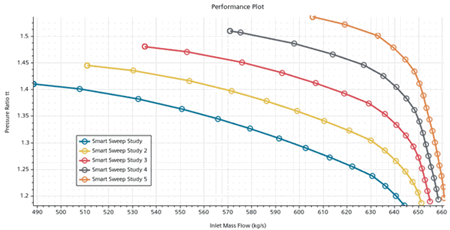
- Performance Plot
- Displays a map for the swept operating conditions.
It is only available for a Smart Sweep Study. Each sweep is added as a seperated data set. See also: Data Series Reference.
- Pareto
- Plots by default the second listed response against the first listed response. This plot is particularly useful for multi-objective optimization, where you want to display the tradeoff between two competing objectives.
Note The pareto plot type is only available for a Optimization Study with the Optimization Type Multiple Objective Tradeoff(Pareto) .

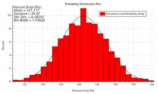
- Probability Distribution
- Plots the number of samples that fall into each bin as a percentage of the total number of samples.
Statistical data is computed and displayed as an annotation on the chart. A normal distribution curve is drawn on the histogram for reference.
For a Robustness and Reliability study, if the plotted response has a constraint, Probability of Failure and Index of Reliability are added to the statistical data. If the response has both a lower and upper constraint then two numbers are shown for each constraint.
This curve displays a normal distribution based on the mean and the standard deviation of the plotted data. The actual distribution of the data is represented by the bars.
Note If the bars fall below the normal distribution of design responses, the baseline values of the input parameters are considered to be robust.
- Monitor
- Plots the monitor values from the selected design set.
The monitor(s) are defined in the reference simulation. During the design study run, Design Manager extracts the monitor values and store them in the Design Manager project file.
Alternatively, a monitor plot can also be created by right-clicking and selecting Create Monitor Plot.
See also: Monitors Reference.
If the reference simulation is a transient analysis, for example a Simcenter STAR-CCM+ In-cylinder run, the monitor plot can be used to visualize the transient monitor data with respect to crank angle between multiple designs.

- Sensitivity
- Plots for each parameter the parametric
sensitivities based on the geometric sensitivities
of this parameter and the adjoint surface
sensitivities of the entire geometry towards the
optimization objective.
This plot type is only available for the optimization type Sequential Quadratic Programming (SQP).

- Cumulative Distribution
- Plots the probability that a variable (a parameter or a response) falls lower than a certain value.
The left axis is the range of the variable values. The bottom axis is the probability with the range [0,1]. Every point in the plot displays the percentage of data points with value less than this point's value on the left axis.
The horizontal line displays the mean value of the variable values.
For surrogate modeling, in order to check the data point distribution in the design space, you are advised to create a cumulative distribution plot for each response with an associated surrogate calculation.
A cumulative distribution plot can be created by right-clicking the node and selecting .

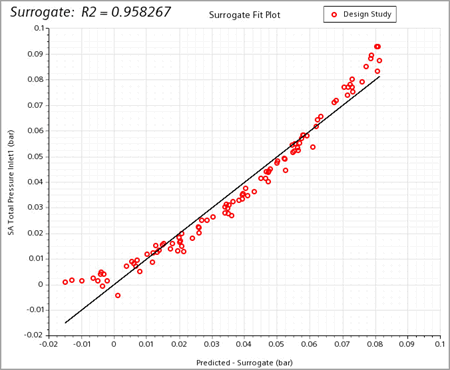
- Surrogate—Surrogate Fit
- A Surrogate Fit plot for a response shows the predicted response values against its actual values, where the reference line is y=x.
This plot type is only available when at least one surrogate is created within the design study.
The corresponding Values Type of this surrogate plot is:
- Predicted—the response value that surrogate predicts for each design.
For the surrogate types Kriging and RBF, the structure of the surrogate function defines the exact fit of the known data.
When you create a surrogate fit, the known data coming from the design runs lie exactly on the reference line y=x. To judge the accuracy of the surrogate prediction of Kriging and RBF, you must look at the cross validation and PRESS residuals.
They are the values by which to judge the accuracy of the surrogate prediction for these two surrogate types.
Example of a Least Squares surrogate fit plot:
- Surrogate—Actual vs Residual
- An Actual vs Residual plot shows the actual values of a response against one of the three following Values Type of its surrogate:
- Residuals—the predicted response value minus the actual response value.
- Cross Validation Residuals (default)— the difference between the actual response value and the response value predicted by the reduced surrogate fit according to the cross-validation scheme. See also Cross Validation Scheme.
- PRESS Residuals—the difference between the actual response value and the predicted response value from the reduced surrogate fit when this design is removed from the surrogate fit. They are identical to the Cross Validation Residuals above when Leave-one-out is selected as Cross Validation Scheme.

- Data Source Type
- Specifies the data source out of the two following options:
- Design Study: Chooses data from a design study, which activates the selection of design studies in Data Source.
- Table: Chooses data from an imported table, which activates the selection of imported tables in Data Source.
- Design Study
- For a pie chart plot, this is the single option to specify the design study from which the pie chart comes.
- Design Sets
- Selects a Design Set of the design study to analyze results. For more details of design sets, refer to Analyzing the Design Study Results.
- Axis Data
- Selects the data series you want to plot.
For XY plots, you can set Bottom Axis Data and Left Axis Data.
For Parallel Coordinates plots, you can select multiple Axis Data and set their order through Axis Order.
- Size Scaling
- Specifies the design parameter for bubble size scaling. Only available for bubble plots. See:Bubble Plot Objects Reference.
- Color Scaling
- Specifies the design parameter for bubble color scaling. Only available for bubble plots. See:Bubble Plot Objects Reference.