|
Sort the plot data, that is, ensure that the ordering of data in the x-direction is observed (XY and monitor plots only)
|
Activate the
Sort Plot Data property of the plot data set.
The following image shows the effect of sorting on raw data. 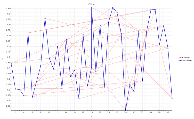
After sorting, the data appears correctly ordered in the x-direction.
|
|
Display a cumulative distribution of data in the x-direction (XY and monitor plots only)
|
Activate the Accumulate Y-Values property of the
plot data set.
This option only operates on values stored
in the data series itself, not all the values from the input of
that data set, such as a monitor. (A data series stores only
those values that were sampled for the plot.)
| Note | If the
Sort Plot Data property is not already activated, it is automatically applied when you activate
Accumulate Y-Values.
|
| Note | You cannot apply a data focus to plot data that has this option applied.
|
|
|
Scale data in one or both directions (XY and monitor plots only)
|
Enter a new value in either or both of the properties
X Scale Factor and
Y Scale Factor of the plot data set, with the following possible effects:
- An entry between 0 and 1 reduces the scale by that factor.
- An entry greater than 1 enlarges the scale accordingly.
- Negative entries create a "mirror image" in the negative direction.
| Note | You cannot apply a data focus to plot data that has this option applied.
|
|
|
Apply an offset in one or both directions, that is, shift the position of the x- and/or y-values by a given quantity (XY and monitor plots only)
|
Enter a value change in either or both of the properties
X Offset and
Y Offset of the plot data set. Your numeric entry is of the same type of quantity as the quantity plotted along the axis.
| Note | You cannot apply a data focus to plot data that has this option applied.
|
|
|
Display selected part values in a single monitor plot
|
Selecting
individual parts is helpful for simulations that have many
parts, such as turbomachines with dozens of blade rows, or
batteries with hundreds of cells. Use one of the following
techniques:
- Specify the desired report parts directly in the monitor plot:
- Select the
[monitor] node and set
Value
Type to Part
Values.
- In the monitor plot, select the node, and use the Parts property to
specify which parts to display in the monitor
plot.
- Specify the desired report parts in the monitor to be
plotted. (See Extracting Report Results on
a Per-Part Basis.)
| Note | The part selection dialog of a report
monitor specifies which part report values to monitor
during the simulation, while the Parts
Data feature of the monitor plot lets you work
with the plot directly. Changing the part selection of the
report monitor resets the monitor data, which can cause loss of
data if you do this during or after the simulation run. By
contrast, changing the part selection of a monitor plot data set
simply changes the display of monitor values without affecting
the data. |
|
|
Control the appearance of selected part
values in a monitor plot
|
- Specify the desired report parts in the monitor plot. (See
instructions for displaying selected part values in a
single monitor plot.)
- Create a plot for the monitor (if you did not already create
one from the report along with the monitor). This plot shows
all the part report values along with the overall value of
the report.
- To modify the line style and symbol style of the individual part value
curves, use the controls in the sub-node of the monitor plot. For details
about these types of controls, see "Data Display Properties
Lookup" in Plot
Data Sets Property Reference.
- To change the colors for individual part value curves,
right-click the Parts Data Style
sub-node and select Edit Child
Colors.
In the
Data Provider Colors dialog,
double-click a color for a desired part curve to open
the color control dialog. For details about the color
control dialog, see Defining Colors.
|
|
Change the order of multiple data series in a plot
|
- Activate the
Data Series Order dialog using one of these techniques:
- Right-click any of the following objects and select
Reorder Data Series:
- The node or display of any plot
- The
Data Series sub-node of a plot, or the corresponding data series in the display
- The
Axis Type sub-node of a histogram plot
- The
node
- Click the right half of the
Data Series Order expert property of the plot node, or click
 (Custom Editor). (Custom Editor).
-
Set the order in the dialog, taking the following into consideration:
- The names of the data series in the list match their names in the legend.
- The data series at the top of the list is plotted on screen first, and the rest are successively plotted in front.
Select one or more items in the
Data Series Order list, and use any of the buttons (top to bottom) as follows:
- Move to top: move series to the top of the list and render first
- Move up: move series up one position
- Move down: move series down one position
- Move to bottom: move series to the bottom of the list and render last
- Alphabetize entire list: reorders the items alphabetically.
- Click
OK.
Alternatively, move a data series by accessing its node:
- Right-click the data series node.
-
Select one of the four options that appear in the sub-menu of the
Reorder menu item:
- Move to top
- Move up
- Move down
- Move to bottom
The order of data series appears in three places in the workspace: the plot display, the legend, and the node tree (where applicable).
|
|
Display the latest appended data within a
specified range (monitor plots only)
|
To specify a range:
- Select the desired Cartesian axis sub-node of the
Axes node.
- Set Range
Mode to Sliding
Window.
The Sliding
Window Options sub-node appears within
the axis node.
- Select the Sliding Window Options
sub-node and enter a value for Sliding Window Width. This value
has no units.
The plot display is set to show a range of
values that is automatically updated as more data points
are appended to the plot during the simulation run. For
example, if you enter a range of
50, the monitor plot displays
values from (Max - 50) to
Max.
- To deactivate the range specification, set Range Mode to
Data
Bounds.
The sliding window Range
Mode yields to manual plot changes
and interactions that change data bounds of the axis. This
includes manually entering a Minimum or Maximum, as well as
activating Lock
Minimum or Lock Maximum properties. For
example, if you activate the Lock
Maximum property, the automatic range
calculations stop. When you deactivate such a property, or
refresh the plot display, the range calculations resume.
|
|
Change the position or orientation of the
legend
|
See Legend Properties Reference.
To reposition the legend, you can use the
properties of its node or move it interactively within the plot.
The legend is a dockable panel and may be redocked by dragging
it elsewhere in the plot display.
|
|
Change how the data is displayed
|
See "Data Display Properties Lookup" in Plot Data Sets
Property Reference. |
