Setting and Viewing Bubble Plots
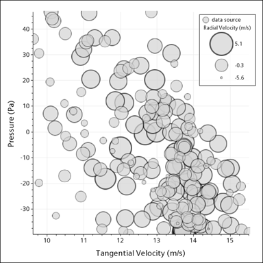
The bubble style lets you add additional layers of information to your XY plot. One layer of information is available by mapping the bubble diameter to a scalar field. Another layer of information comes from mapping the bubble color to a scalar field.
 |
 |
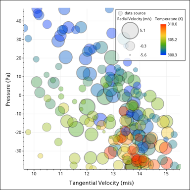 |
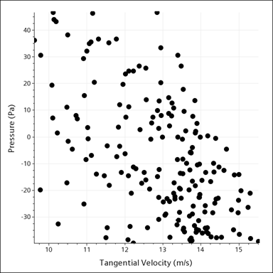
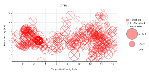
| Relationship between Pressure versus Tangential Velocity | Bubble size adds Radial Velocity | Bubble color adds Temperature |
You are advised not to use the bubble style for data sets with more than a few hundred data points. The large number of symbols would render the plot difficult to read. If you expect a high proportion of overlapping bubbles then you can apply transparency to the bubbles so that bubbles in the background are still visible.
To configure the bubble style for an XY plot to which you have already added X and Y Types:
- In the data set sub-node of the Y Type node of the plot, set the Styles property to Bubble.
-
Select the Bubble Style sub-node of the data set, and
specify properties of the shapes:
-
Set the level of transparency with the Opacity property. Having some transparency
lets you view overlapping symbols easier.
-
Set the level of transparency with the Opacity property. Having some transparency
lets you view overlapping symbols easier.
-
Determine how the symbols vary in size by editing the properties of the
Size Scaling Data node:
-
The Scale mode
property offers the following different methods for calculating the area
of the symbols. As you decide which is best, see the Scale mode property description in Bubble Plot Objects Reference.
- Width (Linear)—the default setting, uses a linear increase in size.
- Logarithmic—uses an exponential variation in size.
- Area (Square
Root)—creates the most visually
natural differentiation between bubble sizes. This option is
recommended if all your data values are positive.
If you choose Logarithmic or Area (Square Root), you can also decide whether to display negative values by activating or deactivating the Show negative symbol sizes option. The symbols that represent negative values contain an "X" to differentiate them from the positive values.
-
The Scale mode
property offers the following different methods for calculating the area
of the symbols. As you decide which is best, see the Scale mode property description in Bubble Plot Objects Reference.
-
To use the bubble color as an information layer:
-
If your plot uses more than one input part, do the following to display them
effectively:
For more information about bubble style options, see Bubble Plot Objects Reference.