Creating XY Plots
XY plots are two-dimensional graphs that allow you to display the relationship between design variables. You can create XY plots before you run a design study or while it is running, and when it is complete. If you create an XY plot before you run the design study or while it is running, it is updated continuously as the study progresses.
- To create a blank XY plot:
- Right-click the Plots node and select .

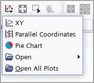
- You can also create a XY plot directly from the toolbar.
The XY Plot Setup dialog opens, in which you specify the plot properties. See Plot Setup Dialog Reference.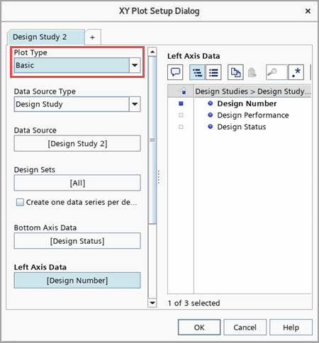
- Right-click the Plots node and select .
- Right-click the node and select Add Data.
- In the Add Data Providers to Plot dialog, select the design study from which to extract data and click OK. Alternatively, you can drag-and-drop the respective node onto the Data Series node of the plot or into the visualization display of the plot.A new data series, which is named after the selected design study, is added to the Data Series node. If you select multiple design studies, multiple data series are created automatically.
- Select the node and set Input Design Sets to the design sets whose data you want to display in the plot. Alternatively, you can drag the respective node into the visualization display of the plot. When you drop the design set, a menu opens that allows you to add the design set to an existing data series in the plot or to create a new data series.
- Select the node and set Type to one of Parameter, Response, Design Number, Design Status and Design Performance. See Axis Data Type for details on each type.
Note If Design Status is chosen as an axis type, the corresponding axis automatically sets the range from 0 to 1. You can drag and drop parameters and responses onto an axis in an XY plot.
- Repeat the last step for the Left Axis Data node. When you add a new data series with the same input design study as a previously added data series, then the new data series uses the same axis data by default.
- To modify the plotting styles of a XY plot:
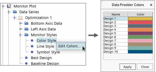
- For a Monitor plot, to modify the Color Style, right-click the node and select Edit Colors.This action opens a Color Editor, where you can select an individual color for each design.
- For a Monitor plot, to modify the Color Style, right-click the node and select Edit Colors.
For a Multiple objective tradeoff study (Pareto front), you can visualize the Pareto ranking for the designs of each Pareto cycle:
- Select the node and set Render Mode to Pareto. By default, Design Manager displays the design ranking for the last cycle:
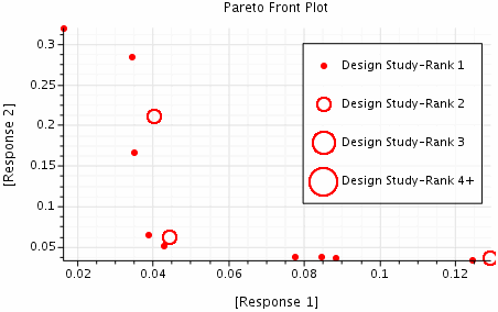
- To plot the ranking for another cycle, select the node and set Cycle to the cycle of interest. You can select multiple cycles if required. Alternatively, you can step through the cycles using the Design Manager Snapshot toolbar. See Toolbars Reference.
- Right-click the respective design study node and select , for more details of the XY plot type refer to Plot Type.
- Right-click the respective response or parameter node and select Create History Plot. It opens a History Plot Setup dialog.
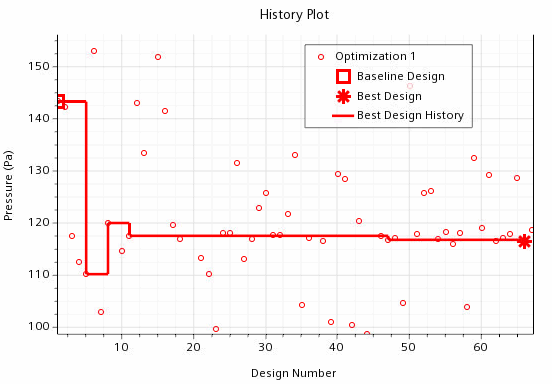
To mark the data point of the best design, where the best design is the design with the highest performance value:
- Select the node and activate Visible. The respective data point is marked in the plot and is listed in the legend.
- Select the node and activate Visible. A line displays the path from the first to the best design.
- Select the node and activate Visible.
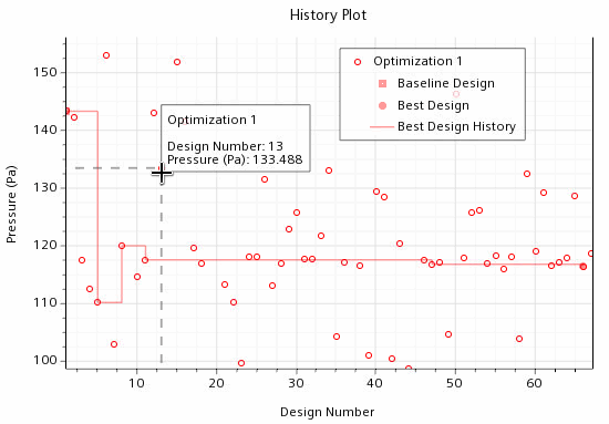
To determine the value of a particular data point:
- Hover the mouse over the data point of interest. The coordinates are displayed next to the pointer.
- Right-click the data points in an XY plot and select the corresponding option.
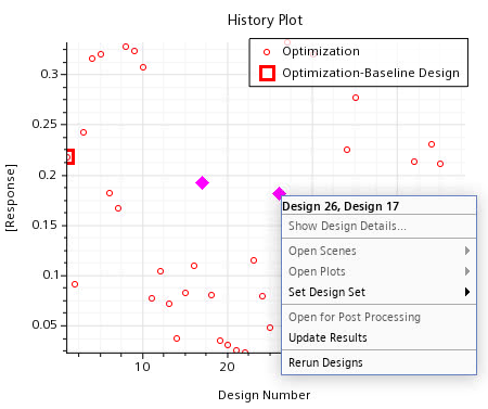
To deselect the data points, you click on an empty area of the plot.
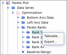
- To display all the plot data in a table view, right-click the node and select Tabulate.
- To export data series, do one of the following:
- To export all data series in a plot,
- Click on an empty area of the plot and select Export.
- Right-click the plot node from the Design Manager project simulation tree and select Export.
- To export specific data series, multi-select the respective data series nodes from the Design Manager project simulation tree, right-click, and select Export.
- To export all data series in a plot,
- In the Export to CSV dialog, save the design set as *.csv.
- Right-click the node and select Tabulate or Export.
Note A Pareto plot is only available for a Multiple Objective Tradeoff (Pareto) Optimization study.