Creating Parallel Coordinates Plots
Parallel Coordinates plots are two-dimensional graphs that allow you to display the relationships between multiple variables at the same time. You can create Parallel Coordinates plots before you run a design study, while it is running, and when it is complete.
-
To create a blank Parallel Coordinates plot:
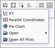
- Right-click the Plots node and select .
- You can also create a Parallel Coordinates plot directly from the toolbar.
The Parallel Plot Setup dialog opens, in which you specify the plot properties. See Plot Setup Dialog Reference.
To add data to the plot:
- Right-click the node and select Add Data.
- In the Add Data Providers to Plot dialog, select the design study from which to extract data and click OK. Alternatively, you can drag-and-drop the respective node onto the Data Series node of the plot or into the visualization display of the plot.A new data series, which is named after the selected design study, is added to the Data Series node. If you select multiple design studies, multiple data series are created automatically.
By default, a Parallel Coordinates plot displays all designs in the selected design study. To display a specific design set:
- Select the node and set Input Design Sets to the design sets of interest. Alternatively, you can drag the respective node into the visualization display of the plot. When you drop the design set, a menu opens that allows you to add the design set to an existing data series in the plot or to create a new data series.
For each data series that you want to display, add an axis to the plot:
- Right-click the node and select New Axis. The Graphic window updates to display the plot axis. The following nodes are added to the object tree:
- : Allows you to specify how the respective axis is plotted (such as the axis title, labels and ticks).
- : Here, you specify what should be plotted along the axis.
- To assign data to an axis, select the respective Axis [n] Data node and set Type to one of Parameter, Response, Design Number, Design Status and Design Performance. See Axis Data Type for details on each type.
You can drag and drop parameters and responses onto an axis in a Parallel Coordinates plots.
When you add a new data series with the same input design study as a previously added data series, then the new data series uses the same axis data by default.
The plot displays a single data line for each design in the selected design study.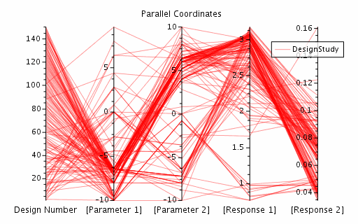
For a Multiple objective tradeoff study (Pareto front), you can visualize the Pareto ranking for the designs of each Pareto cycle:
- Select the node and set Render Mode to Pareto. By default, Design Manager displays the design ranking for the last cycle:
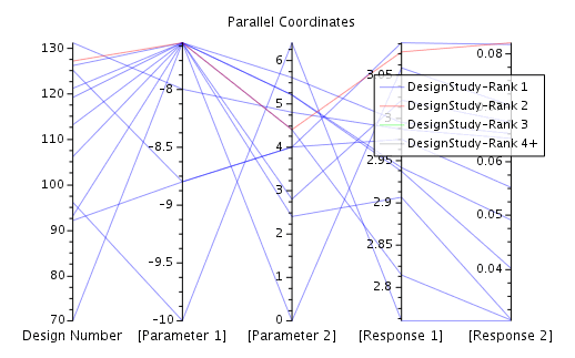
- To plot the ranking for another cycle, select the node and set Cycle to the cycle of interest. You can select multiple cycles if required. Alternatively, you can step through the cycles using the Design Manager Snapshot toolbar. See Toolbars Reference.
You can also create a Parallel Coordinates plot directly from the design study of interest:
- Right-click the respective design study node and select . It opens up a Parallel Plot Setup dialog. By default, the dialog pre-defines an axis for each response in the design study. You can modify the default settings as required.
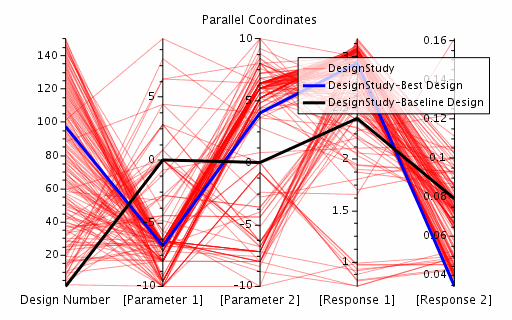
Depending on the study type, Design Manager allows you to mark specific designs in the plot.
To mark the best design, where the best design is the design with the highest performance value:
- Select the node and activate Visible. The respective data line is marked in the plot and is listed in the legend.
To mark the baseline design, where the baseline design is the first design that Design Manager runs in the design study:
- Select the node and activate Visible. The following screenshot displays a Parallel Coordinates plot, where the best design and the baseline design are visible:
To determine the variable values for a design:
- Hover the curser over the data line of interest. The hovered-over line is emphasized, the other lines are muted. A tooltip appears next to the curser.
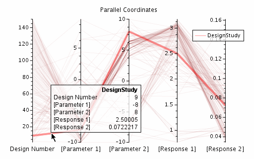
- To control the information that is displayed in the tooltip, select the [plot] node and set Tooltip Display to one of the following options:
- Aggregated Totals Only: Displays the number of aggregated data lines under the curser for each data series.
- First Hit: In addition to the aggregated hit totals, displays the variable values of the first data line under the curser. The first data line is the last rendered line in the last rendered data series.
- First Two Hits: Displays the aggregated hit totals and the variable values of the first two data lines under the curser.
- First Three Hits: Displays the aggregated hit totals and the variable values of the first three data lines under the curser.
When you select a data line, notations of the variable values of the design are displayed at the axes.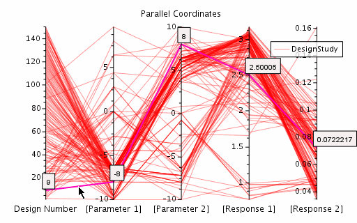
If you select multiple designs within the same data series, notations are hidden to avoid plot clutter.
By default, the axes are spanned across the entire plot area with equal distance between the axes.
- To change the position of an axis, do one of the following:
- Select the node and set x-Position to the relative x-position in the Graphics window, defined over the interval [0,1].
- In the Graphics window, select the axis of interest, drag it horizontally to the desired position, and drop it.
You can move an axis to any position, which allows you to change the order of the axes in the plot. - To respan the axes, right-click the [plot] node and select Respan Axes.
To look at smaller changes of the plotted data, you can zoom in/out between two axes (which affects the two surrounding axes) or on a single axis:
- In the Graphic window, click on a space between the two axes of interest or select a single axis, respectively, and use the middle mouse button to zoom in/out.